GFU Internship Work
During my time majoring in Graphic Design at GFU, I was given the opportunity to do paid internship work for two different departments of the school simultaneously: the engineering department and the design department. Some projects were small, some were larger, some were just pieces in the early stages of the design, and some were full projects I did alone. The experience was a fantastic one which not only gave me some early insight into designing for others visions, but forced me to learn on my feet about balancing multiple projects and jobs at a fast pace.
Engineering Senior Design Brochure
With this project, I was asked to come up with a brochure design for the GFU Engineering Department’s Senior Design Program. This was the last project I worked on for the duration of my internship with this department of the school. The department wanted a clean design which played into the George Fox feel, was eye-catching enough that people would want to pick it up themselves without being offered, and with a serious professional feel to accompany the information about the big name companies the university would partner with as part of the senior design program.
Programs Used: Adobe Photoshop, Illustrator
Client
George Fox University: Engineering Department & Design Department
Year
2022


This project was an interesting first look for me into a design process which ran through several chains. I would present some ideas, those would get an initial critique, they’d be shown to other members of the department that my professor/superior would pass on, and then the likes and dislikes would be brought back to me to make alterations.

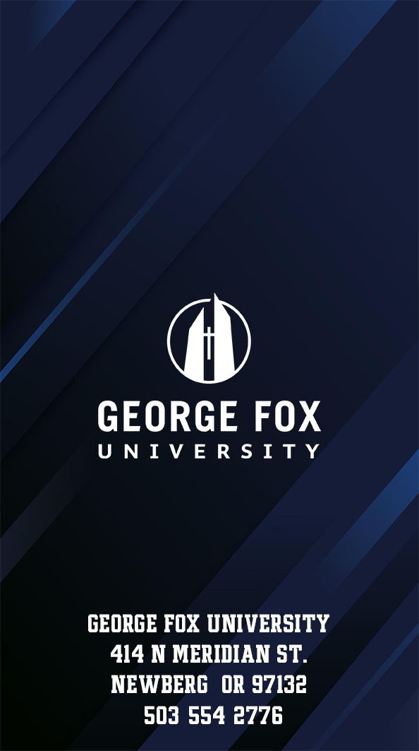
GFU Xmas Flyer
My task with this project was creating a flyer design for the GFU Engineering Christmas Workshop event. This was an event they hold each year where students can come to the department and use the “maker hub” to make their own custom gifts with the technology there.
I was asked to make a design which captured the Christmas feel, gave a clear message about the gift-centered aspect of the event, and clearly communicated all the key information the department wanted advertised: event purpose, gift examples, location and time, and free admission.
Programs Used: Adobe Photoshop, Illustrator
Client
George Fox University: Engineering Department & Design Department
Year
2022


While the first few ideas shared a more simplistic vector-based image style, the final product I chose to run with to the end was the one I felt had a more universal and easily interpreted vision.
The design was made to quickly and effectively establish a bright and happy Christmas tone with gifts at the forefront to clearly get across the focus. The image immediately lets a viewer know this is an event centered around gifts for the holidays.


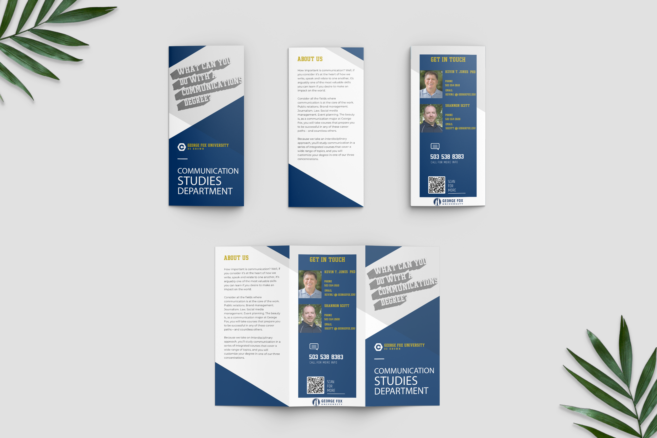
Communications Department Pamphlet
A professor from the department asked me to create a design for a tri-fold style pamphlet which was going to inform potential incoming students about the vast amount of different career paths that are available with a degree in Communications. The communications department wanted there to be a clean and welcoming feel on the outside, and one that didn’t stray super far from the general feel of the department.
Programs Used: Adobe Photoshop, Illustrator, InDesign
Client
George Fox University: Design Department / Communications Department
Year
2022

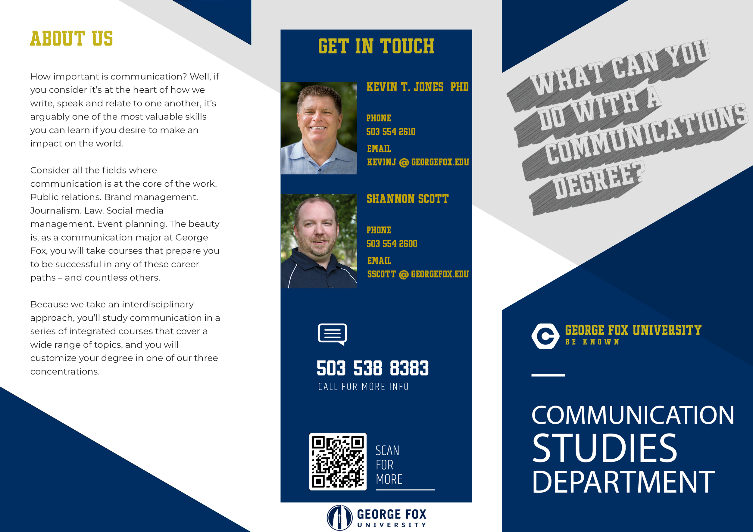
I received this project as part of my internship work with the GFU Design Department, working in conjunction with the Communication Studies Department.
Various University Projects
While not every big project I did in university was through a paid internship, many of them were still very good learning experiences, and incredibly fun to bring to life as well whilst flexing my creativity in new ways.
Book Cover Mock Redesign:
A Perfect Union of Contrary Things


This project was a mostly straightforward assignment; create a new cover for a book which you have read yourself, and you feel you could make a genuinely different and effective cover art for. The main goal behind choosing are books was said to be finding one which you felt you could update or improve on the design, something which maybe had more potential for creativity. My choice was the autobiography of Maynard James Keenan: A Perfect Union of Contrary Things.
Maynard is a very interesting person, and his music and the art that accompanies it has long been an inspiration of mine. The cover of his autobiography, however, was something I truly felt I could improve on. There was nothing wrong with the original cover (simply showing a photo of the man himself) but with a title like this, I felt a lot of potential for paying homage to the imagery his work has inspired in me and countless others.
Programs Used: Adobe Photoshop, Illustrator, Indesign


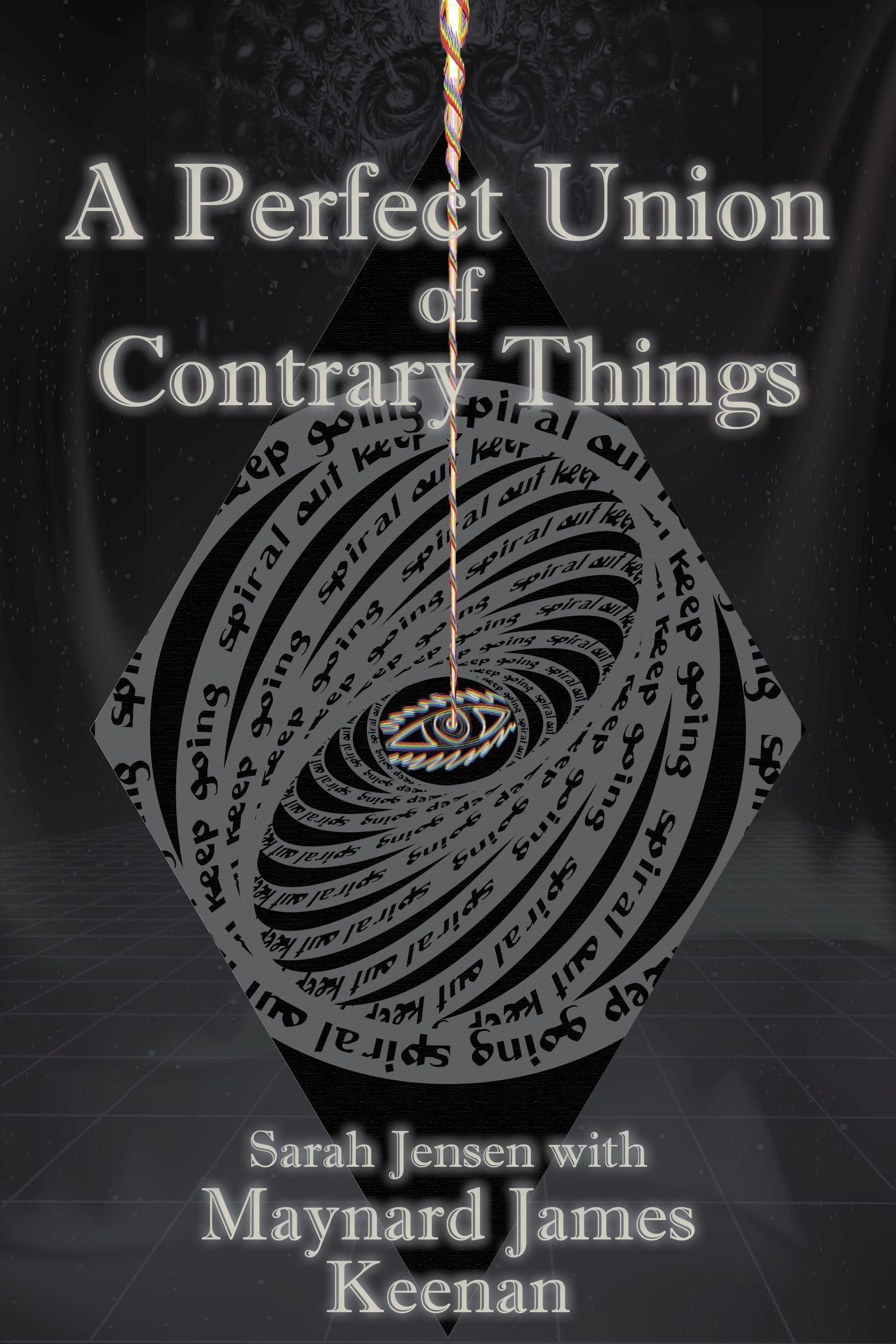


The final part of this project was taking all the files we had put together- front cover, back cover, and spine- and turning it into a physical print which could be placed over the book we chose and displayed as an actual cover. This process was simply setting up all the image quality and measurements accurately, and then creating them in the print shop in a way that was presentable for people to hold and examine.


Mock Brand: Correa Blanco-Brewery Restaurant
This was a class project in which we had to create a new business brand from scratch, and base it in a market we felt had potential or wasn’t overly saturated already. Brewery style resteraunts certainly aren’t a brand new thing in the PNW, but it occured to me that I had never seen one with a heavily latin/ hispanic theme. That’s why I chose to build my brand centered around this characterization.
I wanted to make this brand feel modern, yet paying homage to classic Latin culture at the same time. I took influence from other brewery style restaurants I’ve visited to get a first idea for aesthetic. I then combined this with both my knowledge of Latin culture, as well as that which I gathered from those I know who are of Latin descent.
Programs Used: Adobe Photoshop, InDesign, Illustrator


For the design choices, I took what I knew myself of Latin culture, what I had researched further, and what I gathered in my interviewing of my Latin American friends and family. I drew a lot of inspiration for the color pallet from classic Latin American restaurants and building decorations, why simultaneously trying to keep everything feeling clean and modernistic.


When designing the logo, I chose to keep it the most minimalistic piece of the brand to help with recognition ease, and planned to make the other designs it would be used in unison with far more loud and complex. With the logo simple and clean, using louder colors and more unique imagery- such as the latin-style pattern and Alicanto bird from Chilean mythology used on the alcohol bottles- was a combination I truly loved bringing to life.


Mock Brand Product Design:
Après Glades Snowboarding


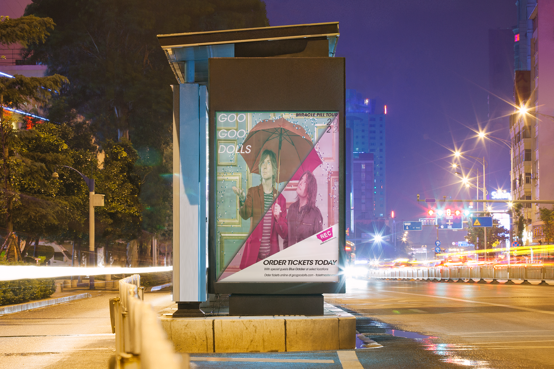
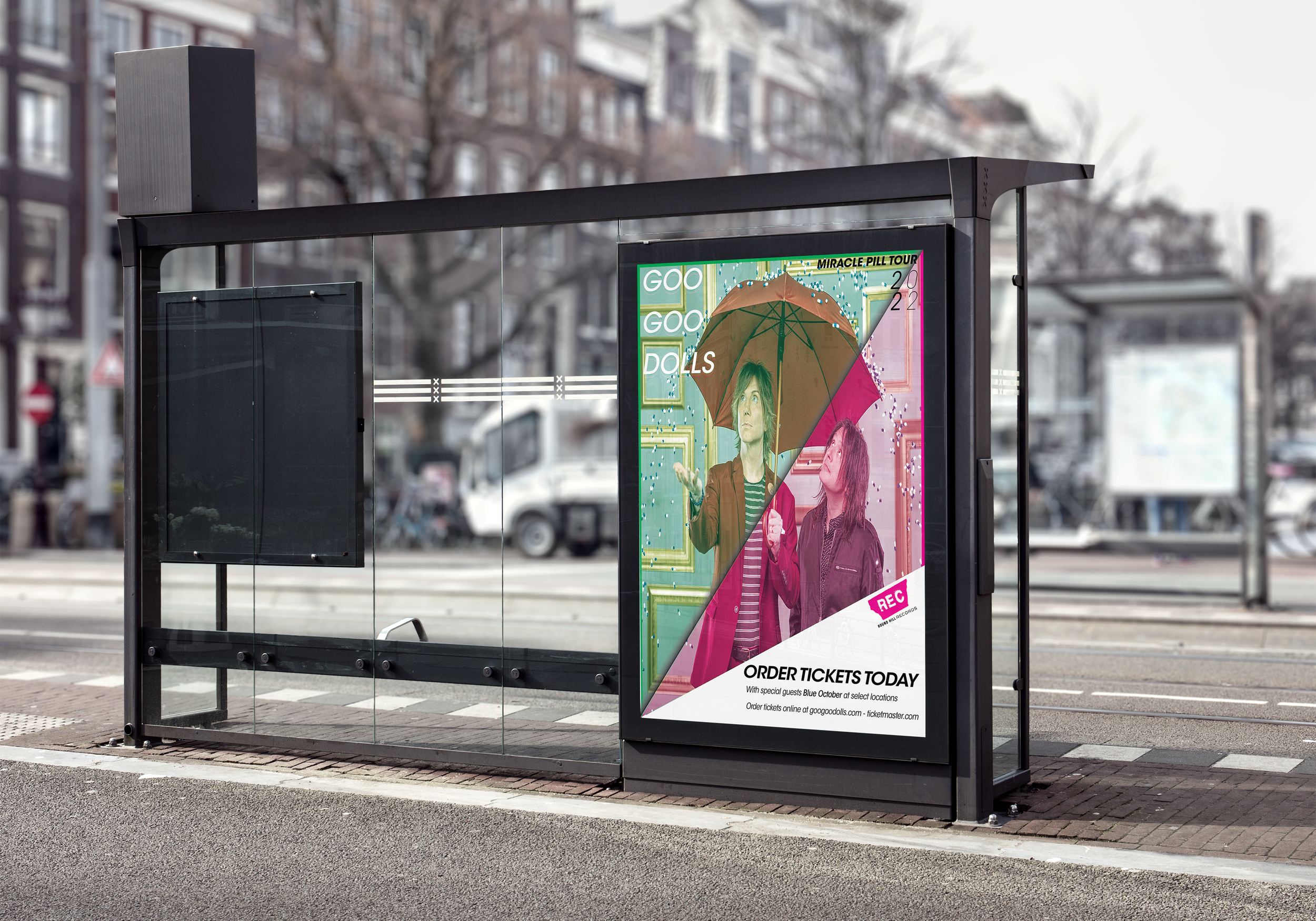
Mock Music Event Poster


Miscellaneous Projects
-
![]()
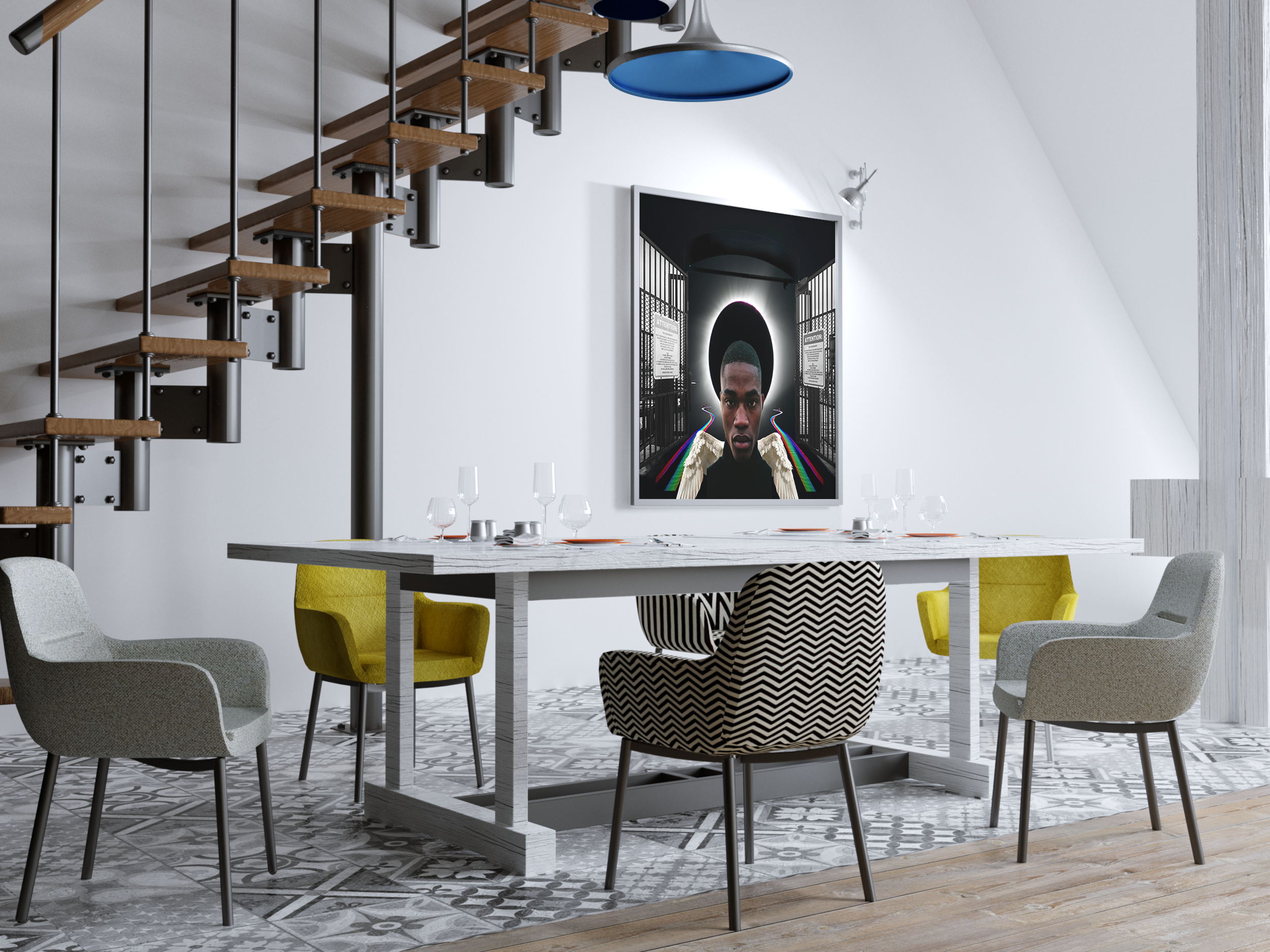
BLM Collage
-
![]()
La Forza Pre-Workout
-
![]()
Clothing Tonic: Business Launch
-
![]()
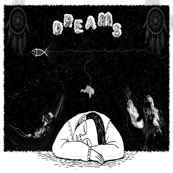
Sleep Playlist Art Collage
-
![]()
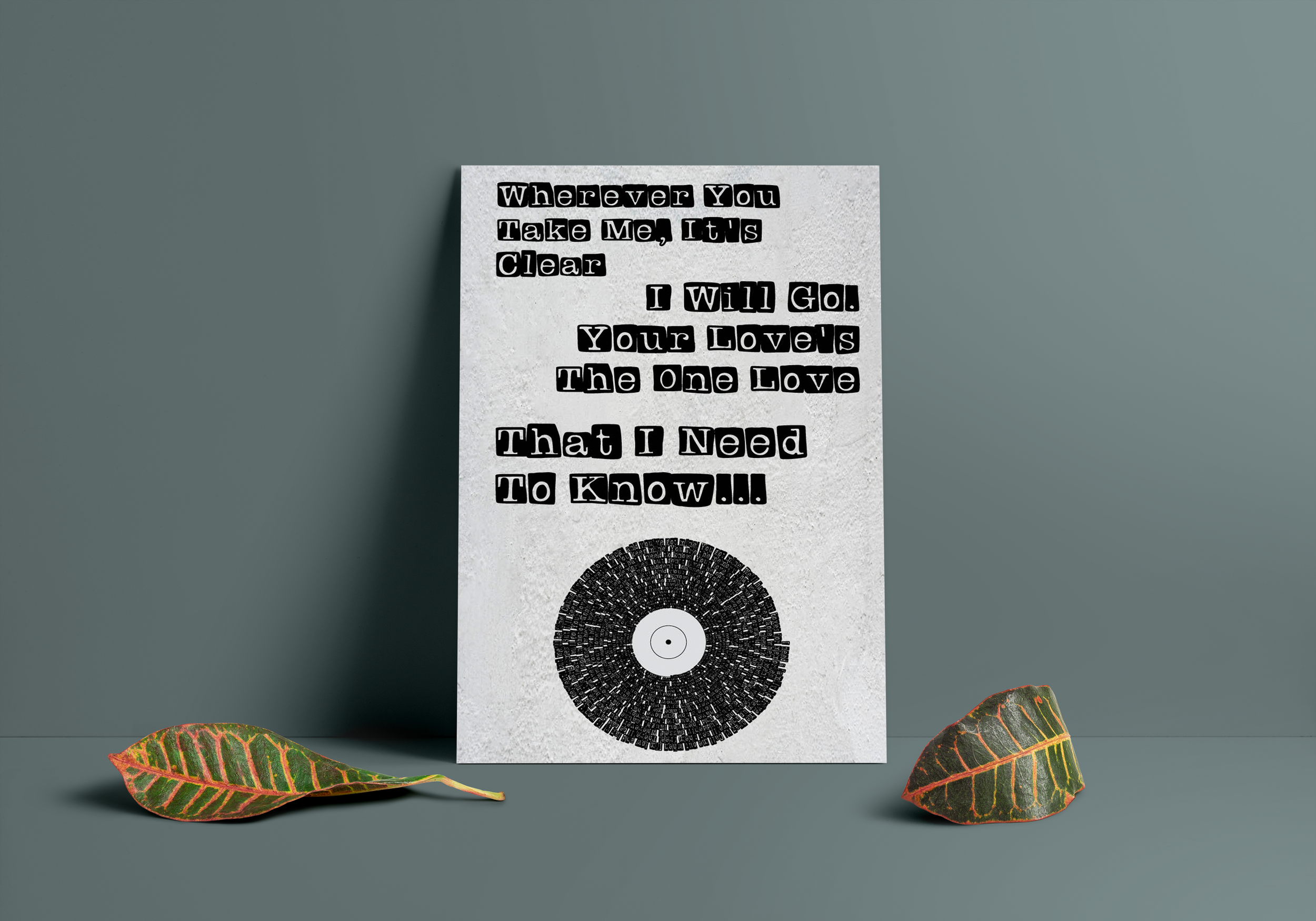
GGD - Boxes Lyric Poster
-
![]()
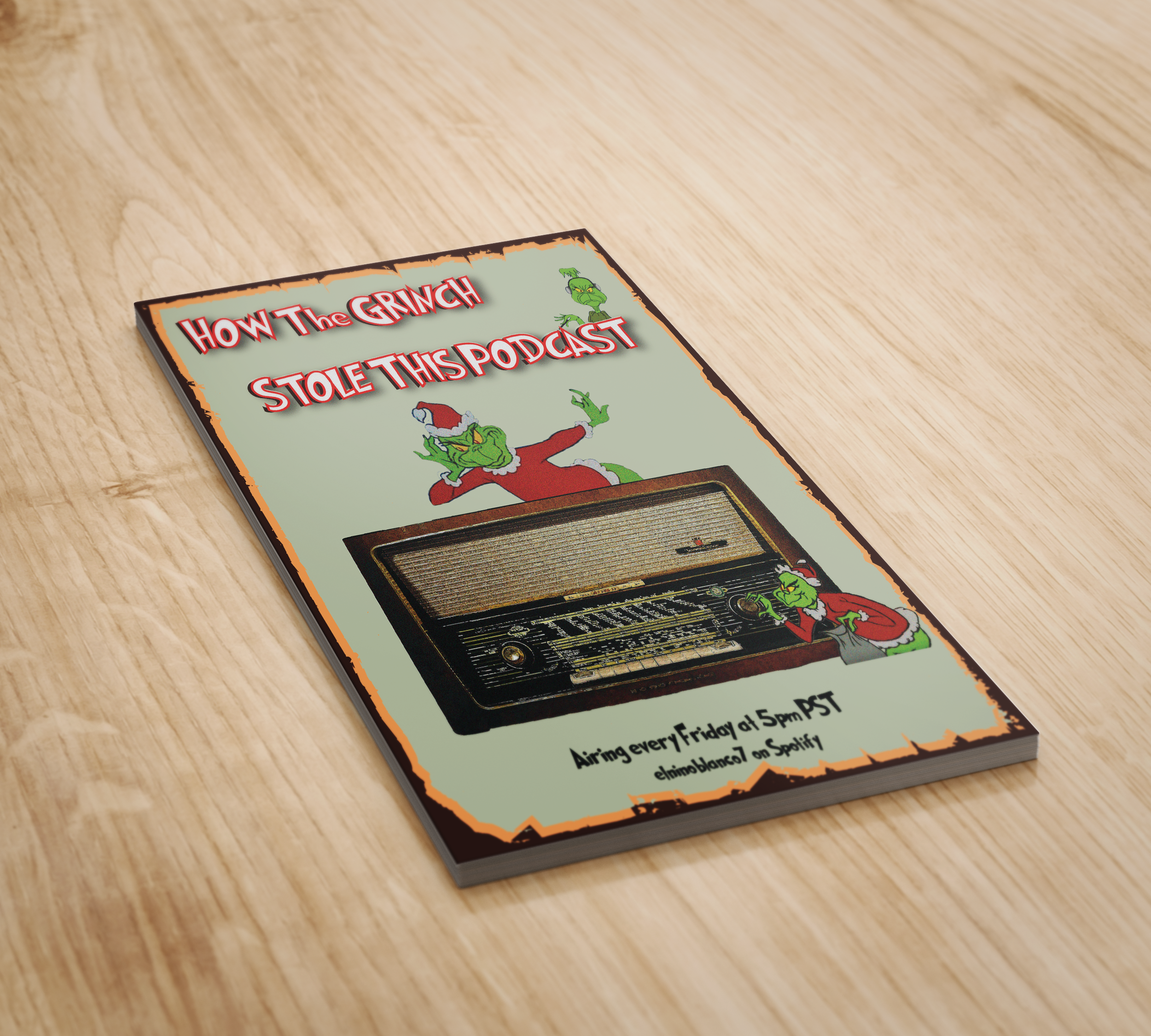
Mock Event Poster